


PT - Desenvolvimento da arte do novo show de Ritchie, "E a Vida Continua", em turnê nacional 2025.
EN - Artwork development for Ritchie's new show, 'E a Vida Continua', on its 2025 national tour.
EN - Artwork development for Ritchie's new show, 'E a Vida Continua', on its 2025 national tour.


PT -Tive a honra de ter sido convidado a desenvolver a arte do novo show do renomeado artista Ritchie.
O conceito inicial sugeria uma engrenagem de relógio em uma paleta de amarelo já definida, idealizado por Eduardo Seabra sob direção de arte de Alexandre Arrabal, que foi chamado pelo consagrado Steve Altit. Apresentei diversas propostas visuais que exploravam essa ideia, utilizando o Key Visual existente e tendo o show anterior como referência para alinhamento da linguagem.
Após algumas versões, uma foi escolhida e trabalhada em conjunto com Seabra e Arrabal. Ao ser apresentada a Altit, ele optou por uma abordagem mais minimalista, resultando na arte final incrível que está sendo usada para o novo show "E a Vida Continua!".
---------------------------------------------------------------------------------------------------
EN - I had the honor of being invited to develop the artwork for the new show by renowned artist Ritchie.
The initial concept suggested a clock gear in a pre-defined yellow palette, envisioned by Eduardo Seabra under the art direction of Alexandre Arrabal, who was brought in by the acclaimed Steve Altit. I presented several visual proposals that explored this idea, using the existing Key Visual and the previous show as references to ensure consistency in style.
After a few iterations, one version was selected and refined in collaboration with Seabra and Arrabal. When presented to Altit, he opted for a more minimalist approach, resulting in the incredible final artwork now being used for the new show "E a Vida Continua!" ("And Life Goes On!").
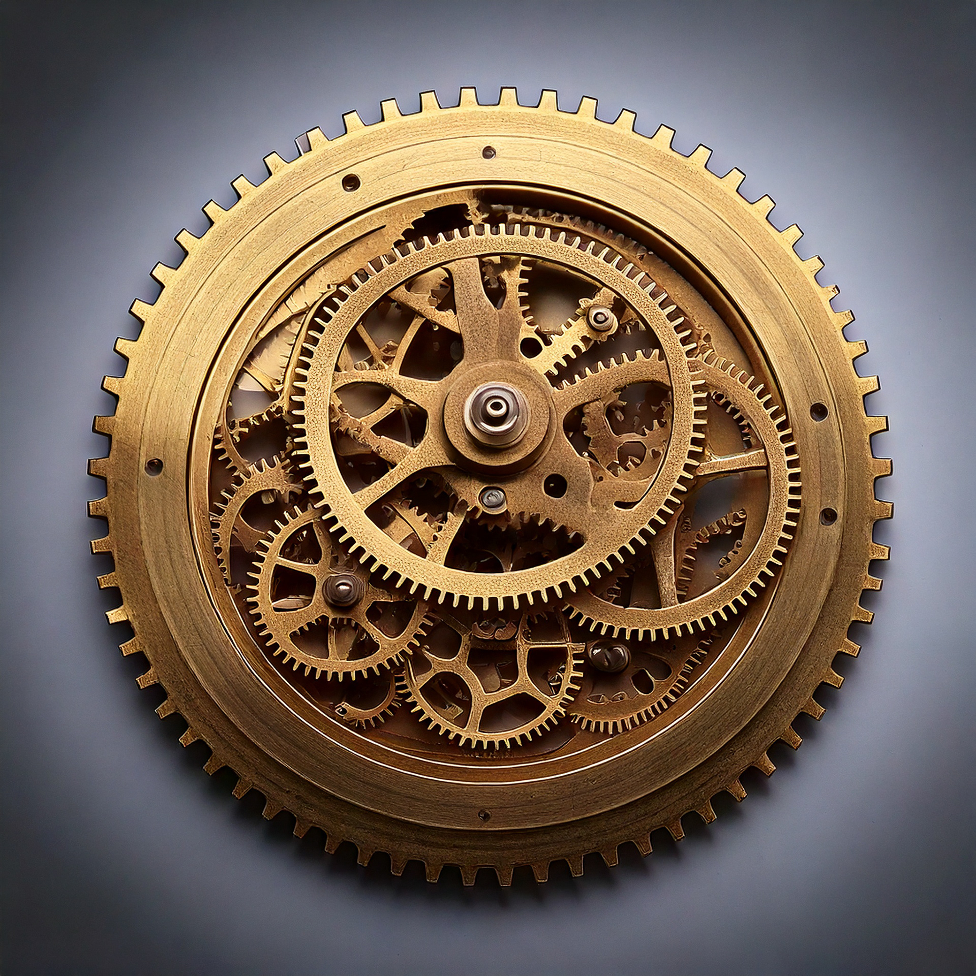
*PT - Engrenagem base para o conceito
EN - The gear used as the concept's foundation.

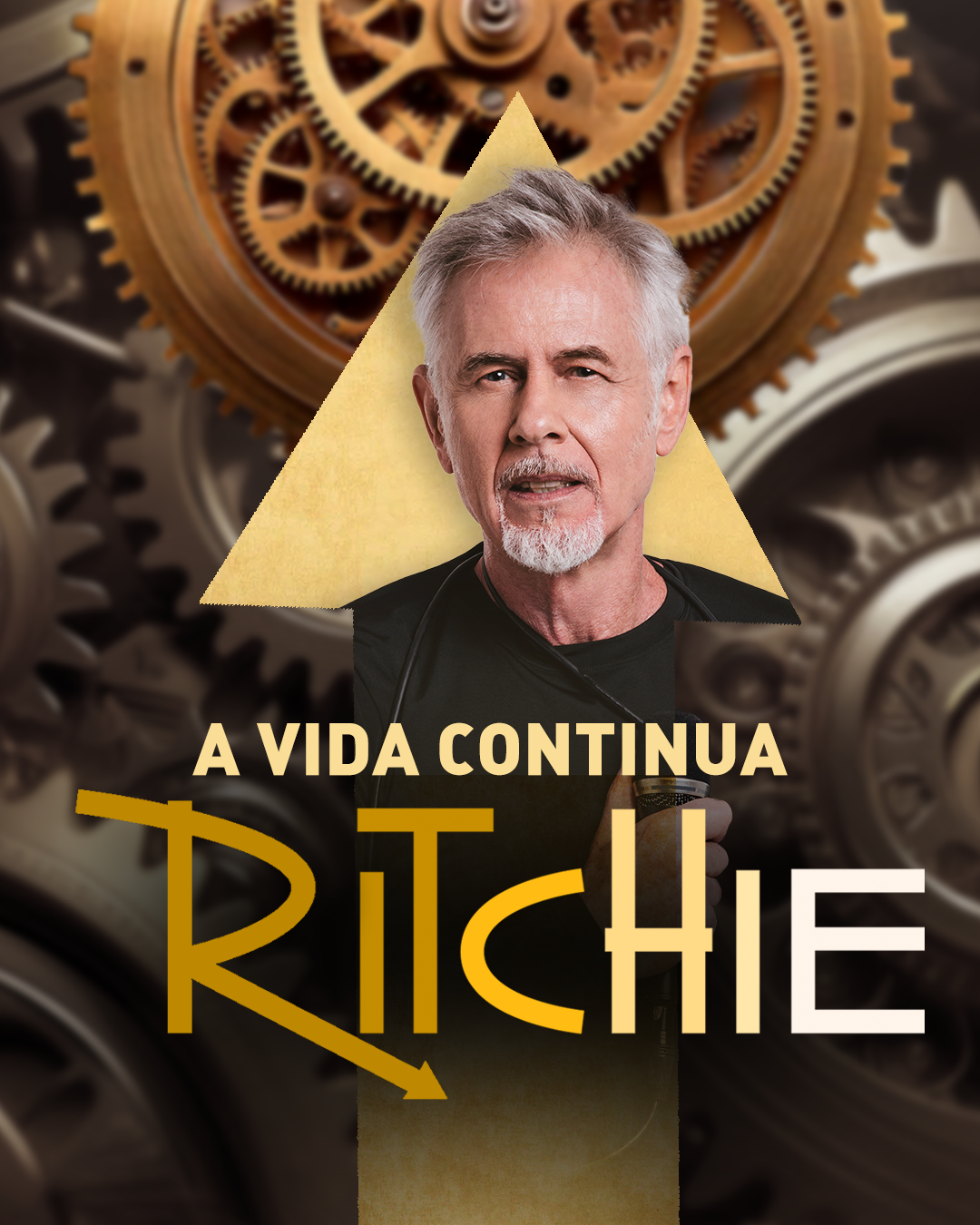
*PT - Algumas das versões apresentadas. Uma das ideias testadas foi mudar o "R" da logo do Ritchie para uma seta, ao em vez de um circulo. Para simbolizar continuidade e um ponteiro de um relógio. Nos testes, não foi incluído a conjunção "e" original do nome do show.
EN - Some of the proposed versions. One of the ideas tested was to change the "R" in Ritchie's logo to an arrow instead of a circle, to symbolize continuity and a clock hand. In these tests, the original conjunction 'e' (and) from the show's name was not included.
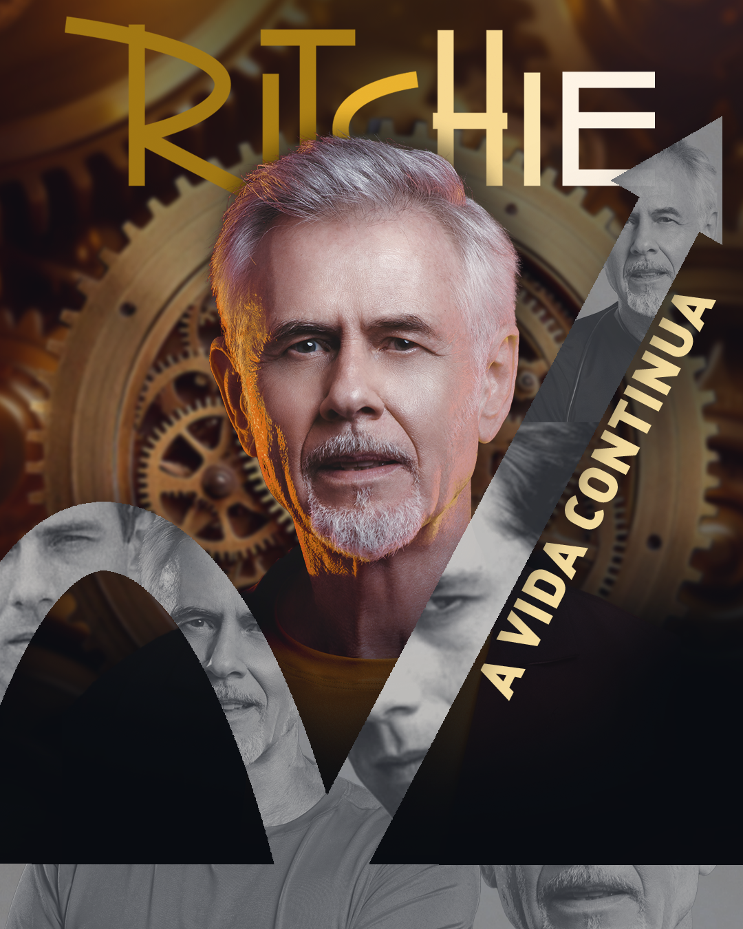
*Arte para aprovação indo para um caminho mais minimalista escolhido (vertical).
EN - The vertical artwork for approval: Minimalist approach approved

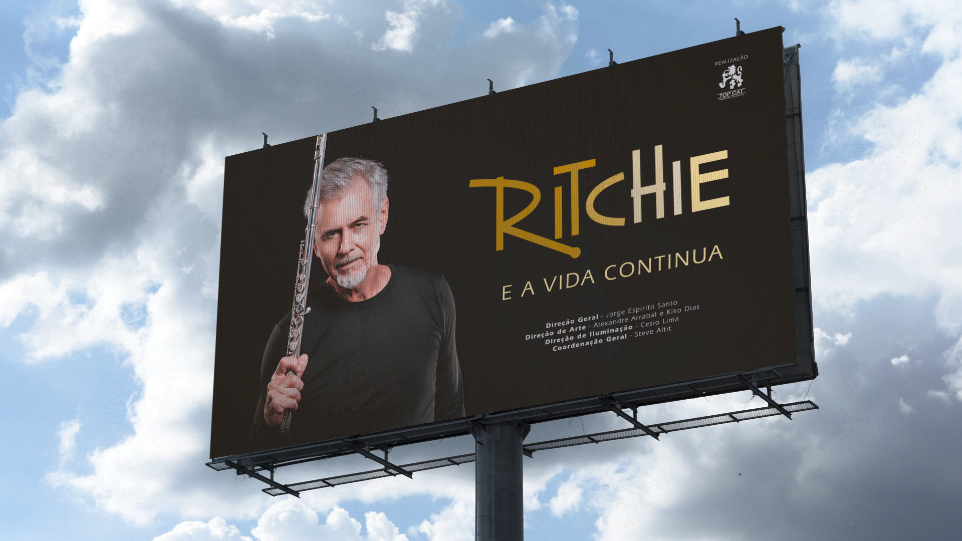
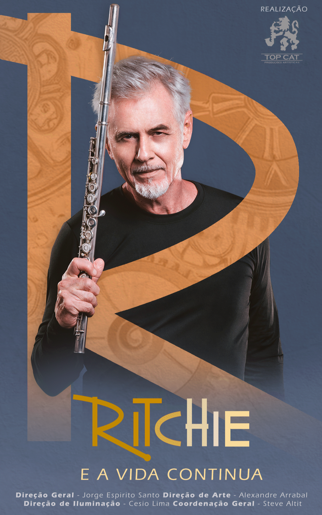
*PT - Mockups feitos apenas para esse projeto do Behance para uma melhor visualização.
EN -To better showcase the design, these mockups were created exclusively for this Behance project

PT - Uma contribuição estratégica e marcante neste projeto foi a alteração da paleta de cores da logo de Ritchie. Originalmente azul, a transformei em um tom amarelo seguindo a paleta, mantendo o degradê original. Essa mudança foi incorporada e está sendo utilizada na identidade visual nessa nova turnê do artista, reforçando o impacto direto do nosso trabalho na marca.
---------------------------------------------------------------------------------------------------
EN - A strategic and significant contribution to this project was the alteration of Ritchie's logo color palette. Originally blue, I transformed it into a pastel yellow hue, while retaining the original gradient. This change was incorporated and is currently being used in the artist's visual identity for his tour, reinforcing the direct impact of our work on the brand.
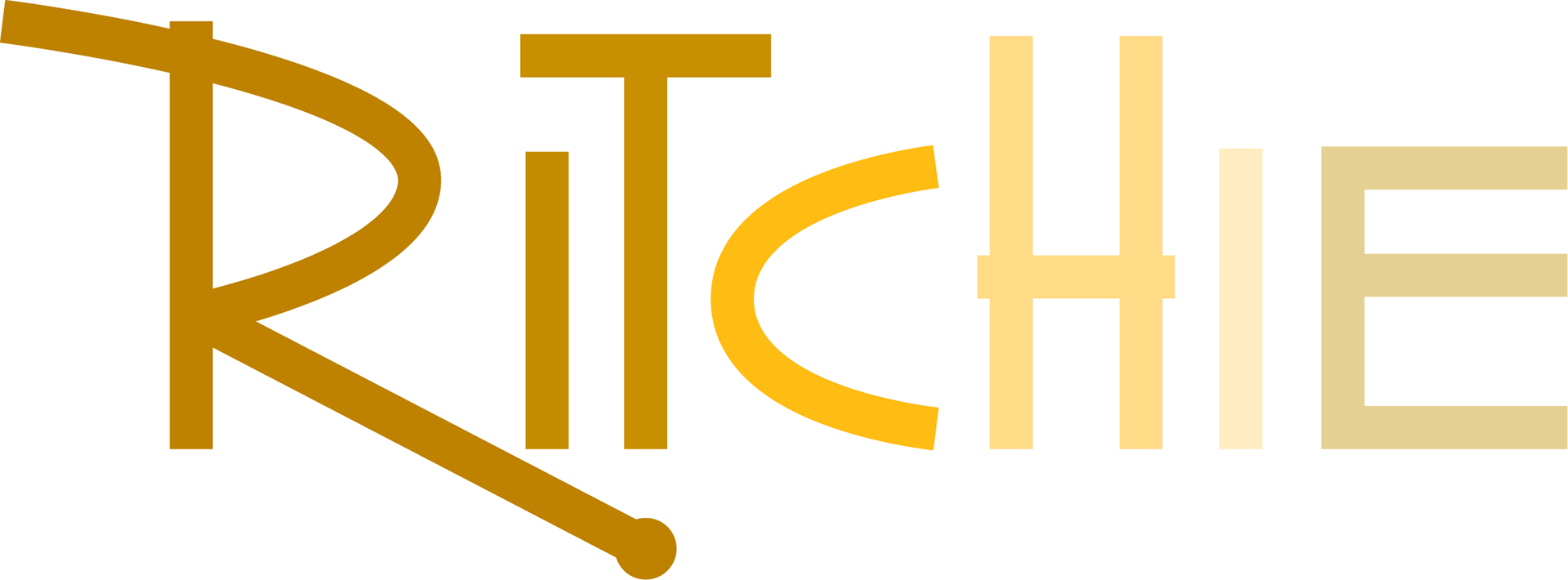
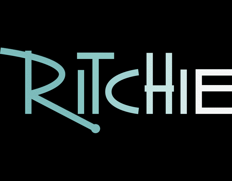
*PT - Logo com paleta de cor antiga: Logo com paleta de cor nova
EN - Original Palette : Updated Palette
Thanks
for watching!